Utility Bills: a Customer-focused Approach
Published: 14/07/22
Studies by Uswitch, a UK price comparison site, state that utility bills can be confusing for some customers and include information which is difficult to locate. This blog will explore how bills can be designed effectively to deliver high levels of customer engagement and understanding.
The Power of a Bill
In theory utility bills are there not only to inform customers of important information but also to build strong customer relationships. Why therefore are some customers complaining that utility bills are not easy to understand?
Critics of the common utility bill are not hard to find it seems. ComEd, (an electricity utility company in Mid-West America), say that despite the humble billing statement being the most impactful communication a utility company has with their customer, typically little thought is given to bill design to ensure communication is effective and useful. This is clearly a missed opportunity and if true means that ineffective bill design could potentially damage the bond between customers and energy providers.
Common Customer Issues
Jendev spoke to Brian O’Gorman, Customer Care Team Leader at Jersey Electricity Plc regarding the main issues that drive customers contact. He stated that the majority of calls Jersey Electricity receive at their customer service centre are about cost queries, rather than the bill design itself. Jersey Electricity’s current bill design has evolved over a period of 10 to 15 years and consequently customer and JE team feedback has been incorporated into the design to improve communication and customer understanding.
O’Gorman gave a specific example of how the design was improved in response to customer feedback. He stated:
“A few years ago, customers did not understand the estimation code (E) that went alongside the estimated figures. We listened to our customers and provided an explanation on the back of the bill. After this had been completed, we still received a small number of calls regarding the code so we removed it altogether and instead wrote a small explanation at the bottom of the bill, explaining when estimated reads had been used. This was pre-intelligent metering of course, where all reads are actuals”.
It seems Jersey Electricity have listened to their customers and designed their bills in such a way that customers do not need to question the design. However there is always room for improvement and bill design is moving forward, particularly as customer interest in consumption and tariff switching increases.
The Good…
A well-designed utility bill enables customers to easily identify and understand key information, such as the amount due. Charges should be clearly stated and understandable for all. Use of colour and font can draw attention to ‘need to know’ information the customer is typically searching for when scan-reading their bill.
Including graphs and images to present data can encourage customer engagement. This is because visual images are processed 60,000 times faster than text when the information enters the brain. Utility bills without graphs and images may contribute to reduced interest levels. ‘Need to know’ information that customers generally look for should stand out more, making it is easy to find. Less important information should not distract customer attention away from key information.
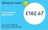
Important information should be on the front of the bill and lower value information should be located on the rear of the bill ideally. The example below was taken from the back of a utility bill. The usage is explained simply and in an understandable format. Information about kilowatts is explained with an image that makes it easy to read. Also, tariff options are simply presented to the customer, stating how much they would pay if they happened to change to an alternate tariff / rate.
The Bad…
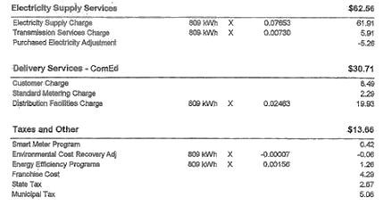
Important information can be buried within a myriad of text causing customers to lose interest or misunderstand their utility bill. In the example on the right, the customer would be required to read through the bill in detail in order to be able to find the information that they need. Little in this example makes the bill appealing.
Small font on a utility bill can make it hard to read for some customers and cause them to potentially contact the utility company to gain further information, increasing the utility company’s ‘cost to serve’. Fonts should be easy to read for all customers, and large enough for customers with poor sight.
Using unexplained jargon within a utility bill can add to customer confusion and may lead to customers possibly failing to act on consumption information to find an optimum tariff and / or being expensive to serve by regularly contacting the company to query information.
Key Considerations
Utility bills should be effective in informing customers about the services they are paying for. Research by UtiliPoint explains that a well thought out and easy to understand utility bill can help reduce costly customer enquiries. It is therefore important for utilities to take into consideration, when designing a bill, that the layout is clear for customers of all ages so that they are able to find the information required. Utility bills should take little time out of a customer’s day to read.
Key Points to Consider
- A bill is a key communication tool for utilities and careful consideration should be given to design.
- A simple, well explained bill can reduce customer enquiries to utility companies’ call centres and build strong customer relationships.
- Good utility bill design makes it easier for customers to understand key information, such as their usage, the amount due and potential ways to save money.
- Utility bills should avoid jargon words and including large groups of text which are difficult to comprehend at first glance.
- Utilities have a responsibility to review and improve bill design where possible.